Company: Macy’s Inc
The Brief
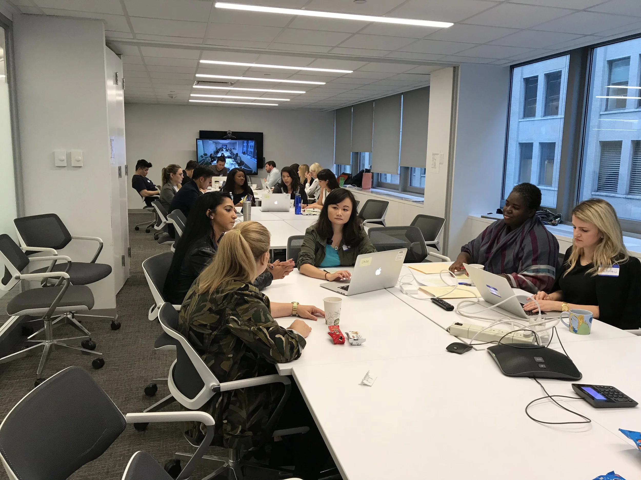
With a pitch to a refresh of the whole Macy’s e-commerce platform/product directly to the new President of the Macy’s Inc, we got a green light from the new appointed Senior Management themselves. With a core team of 4 Designers (including myself), 2 VPs, 2 Directors, 2 PMs, 2 Devs, we ideated, designed, tested the new Macy’s website. There were 10 tests involved with positive feedback. You can see the study below
The Task
Objective
Recreate a new Macy’s e-commerce user experience to gain a new audience (younger Users) and retain current ones.
Project Type
Product Refresh
Timeline
10 Weeks (Wires & Flow, UI, Testing)
18 Weeks (Front & Backend)
Platform
Web (Responsive) E-Commerce
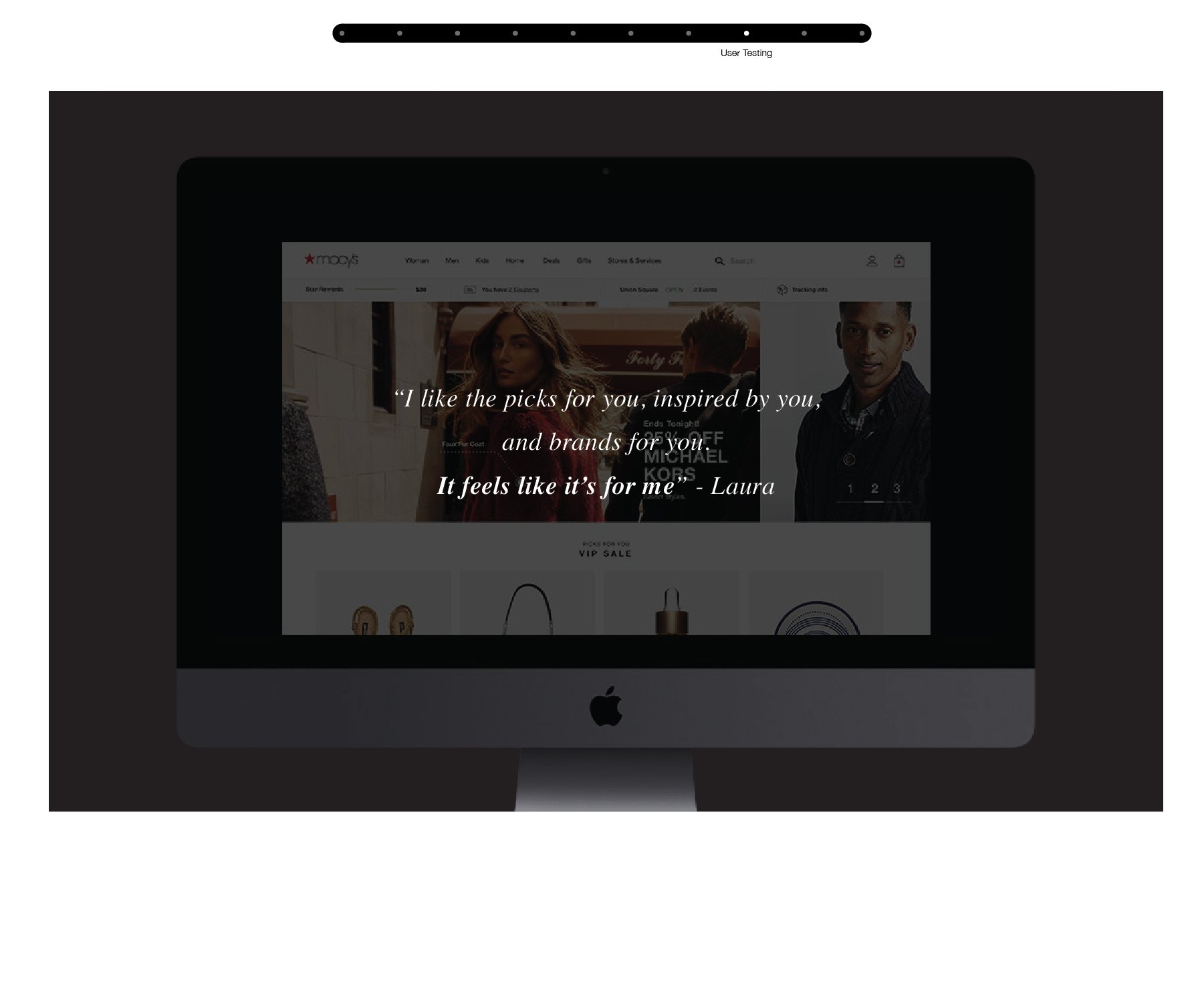
User Testing
10 Sessions (w/ 8 Participants Each)
Year
2018
Company Type
Corporation (Fortune 500)
Current Experience
From a glance, when trying to browse Macys.com, we had many initial thoughts:
Hard to find products
Many clicks just to get to what I’m looking. Can we shorten the journey
Why is the site architecture like this? Can we rethink the discovery & browsing journey for the User?
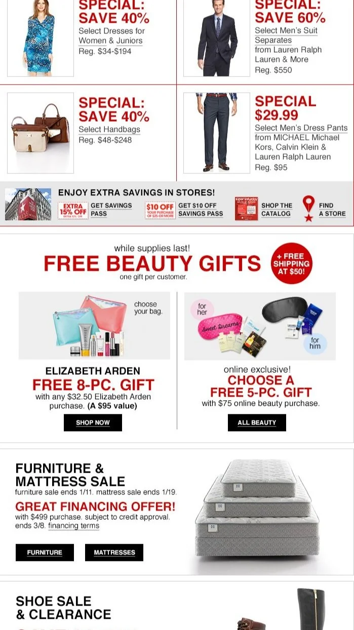
It’s all about sales, sales, sales and nothing for me (personalized content)
Too cluttered, can we simplify this content? How can we simplify not just the UI but the path to browse & conversion (what information does the User need to browse or make a quick conversion?)
Need a way to retain new Users. Do we have an incentive? Rewards? Personalization on suggestions? Easy to find search?
I get alot of unnecessary info in my cart/checkout. Can we bring the most important information up to the front of the User
Can we simplify the UI or create a better design library? Looks very antiquated & not consistent


Current State
-
• Stock is low compared to previous years at $22.99 USD/Share.2(014: ~55.27 USD; 2015: ~72.13 USD;)
• Many competitors (Target, Amazon, Walmart, etc.)
-
• Research has shown that most Millenials do not perceive the Macy’s brand as “innovative” or “cool/hip”
• Macy’s is still a household name with much recognition, heritage, & nostalgia
• Brands associated with Macy’s are not connecting with a younger audience
• Macy’s relies too much on flash sales, which is damaging the perceived value of it’s products
-
• Current targeted buyer is female, ~42 years old and above
• Macy’s has fewer millenial shoppers while our competitors are focused on attracting a
younger audience
-
• Focus is on quick sales with low profit margins; we could achieve a higher profit margin on each sale by better targeting specific users with our products
• Need to rethink our older technology and keep striving for innovation in all business areas
• Macy’s has a solid Brick & Mortar presence, but we need to leverage digital tools to reach a wider
audience so that we stay competitive
• We could be more effectively innovating within our large teams
• User testing is not creating enough impact


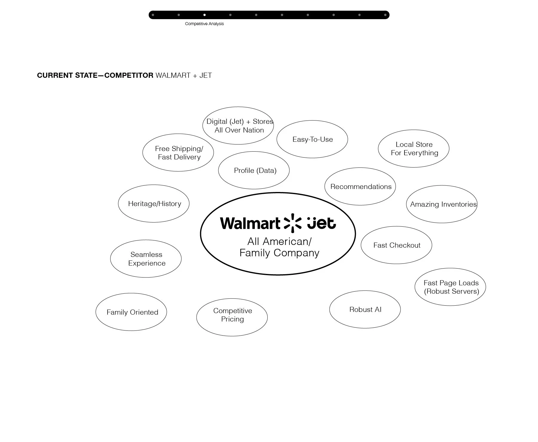
Competitive
Analysis


The Research & Game Plan
-
Heritage Fortune 500 behemoth has been stale with not just digital brand, but its image amongst customers. Feel and online experience is very poor and antiquated.
-
Nordstrom, Amazon, Zara, Walmart, Kohls, JCPenny, and many other department stores
-
Users think the website is very ugly, hard to find products, hard from point A to B (start to finish), look & feel is very cluttered, too many ads; should be easier to digest all content all once (whetheris process, clothes, copy, checkout info, promo info, etc.)
-
Rethink the wheel (based on User’s Journey) and make a more inspiring and easier to use experience overall by making the main necessities digestable
-
Tackle page by page, based on the User’s feedback and ideation, rethink all the details, needs, but in a very inspiring way that is mainly not just easy but enjoyable for the User to shop and browse. Have iterations and test them as often to get the proper and correct path to the right experience for Macy’s.com
-
10 Weeks; 4 Designers, 2 Directors, 2 VPs, 2 PMs, 2 Devs

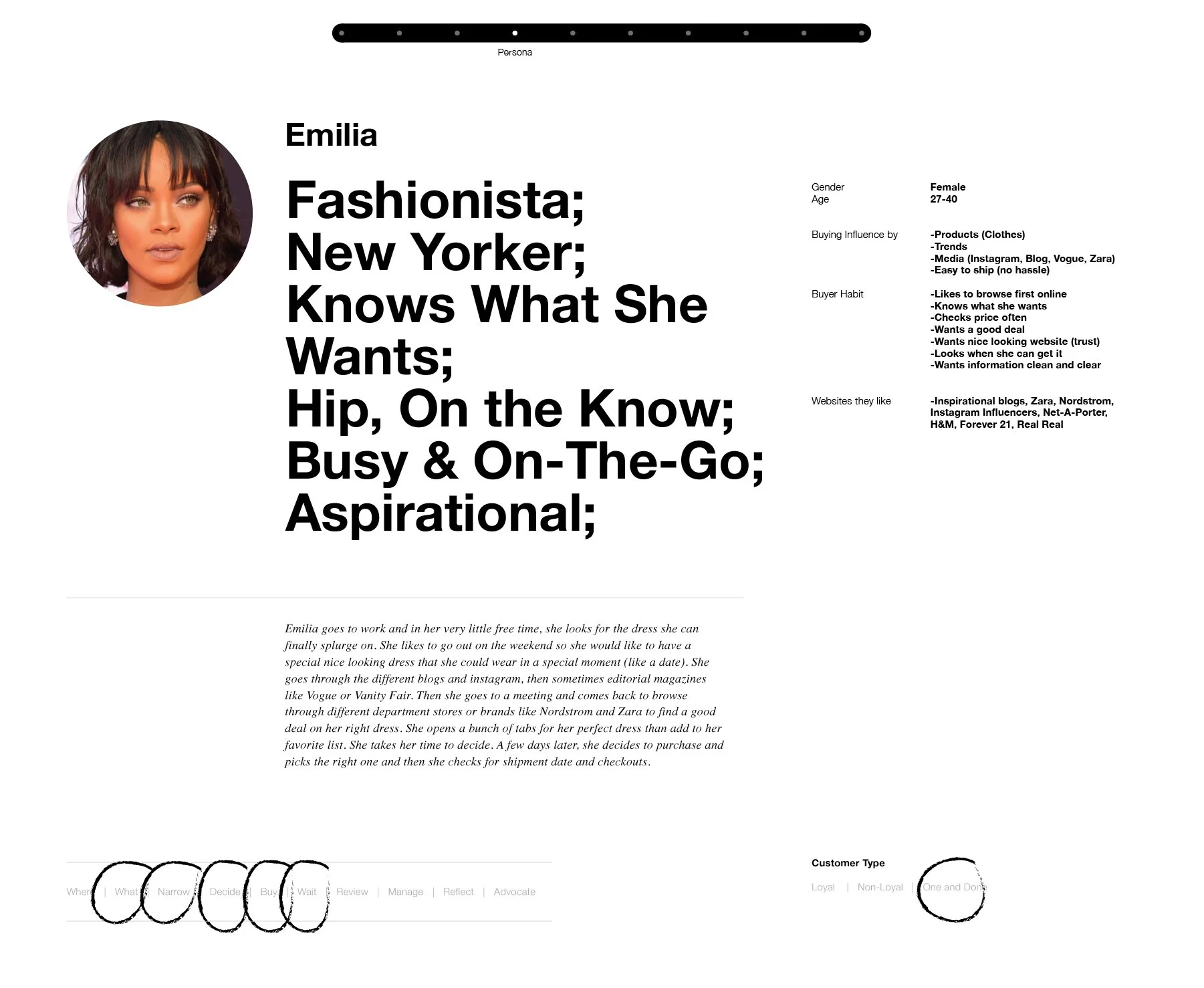
The Persona
After many rounds of research & focus groups, we found 3 main personas: A younger browser (Elle), a working women in her 30’s, and an older women 50-70. Due to the tight deadline (8 weeks) and the upcoming Prom season coming up, we decided to go with Elle, the younger persona

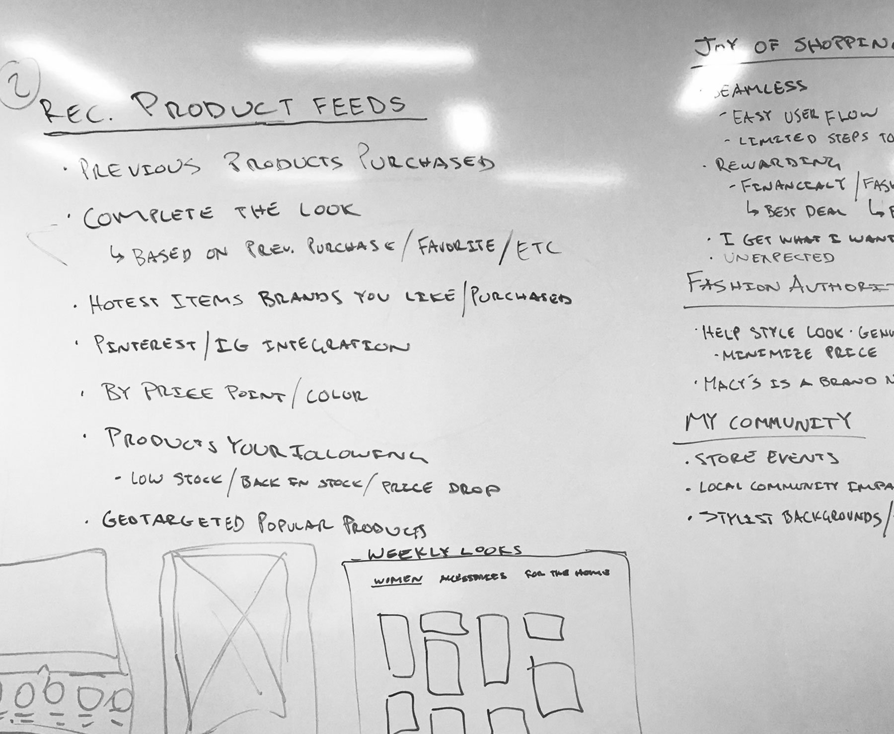
Architecture

Wireframes & Flow
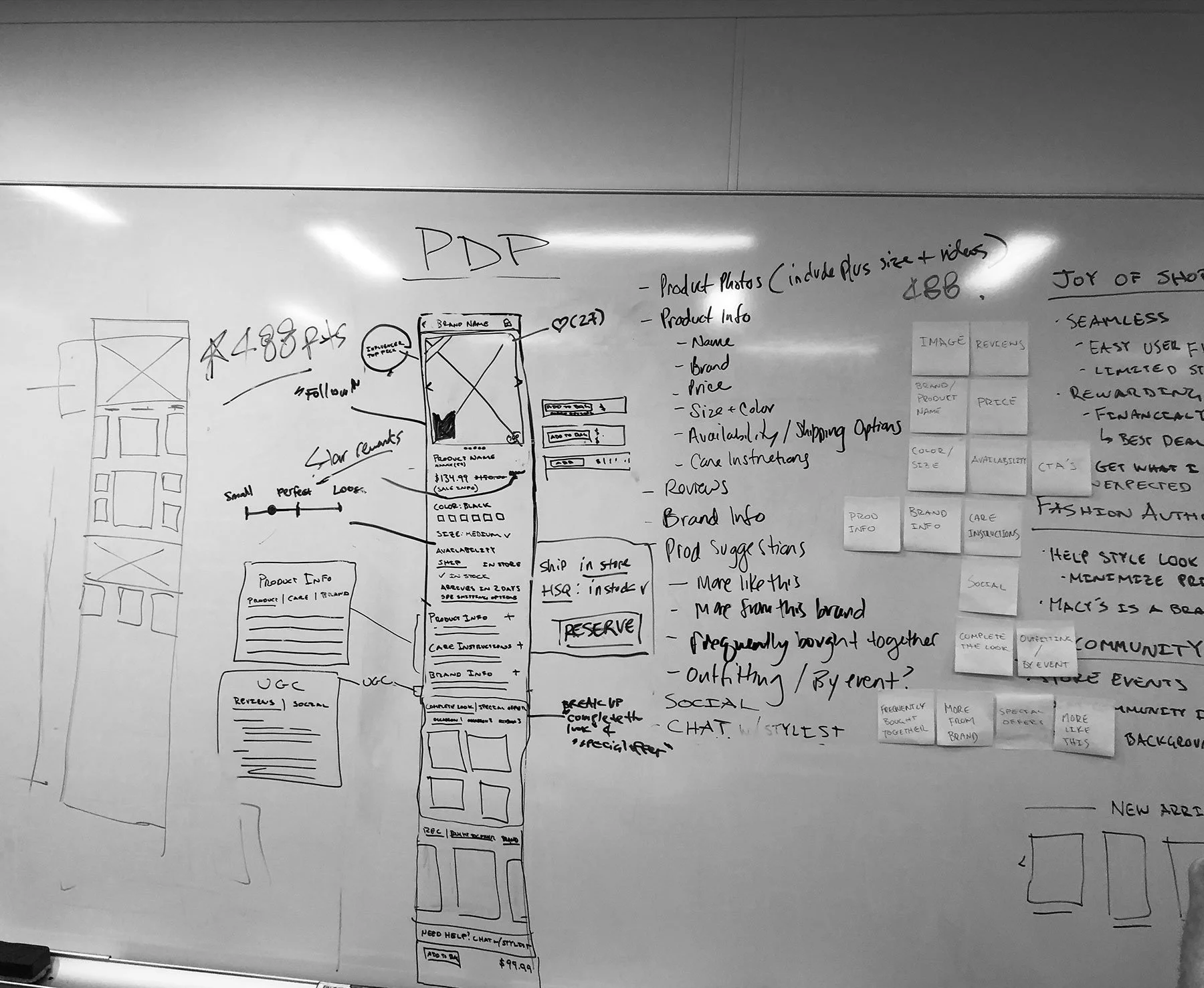


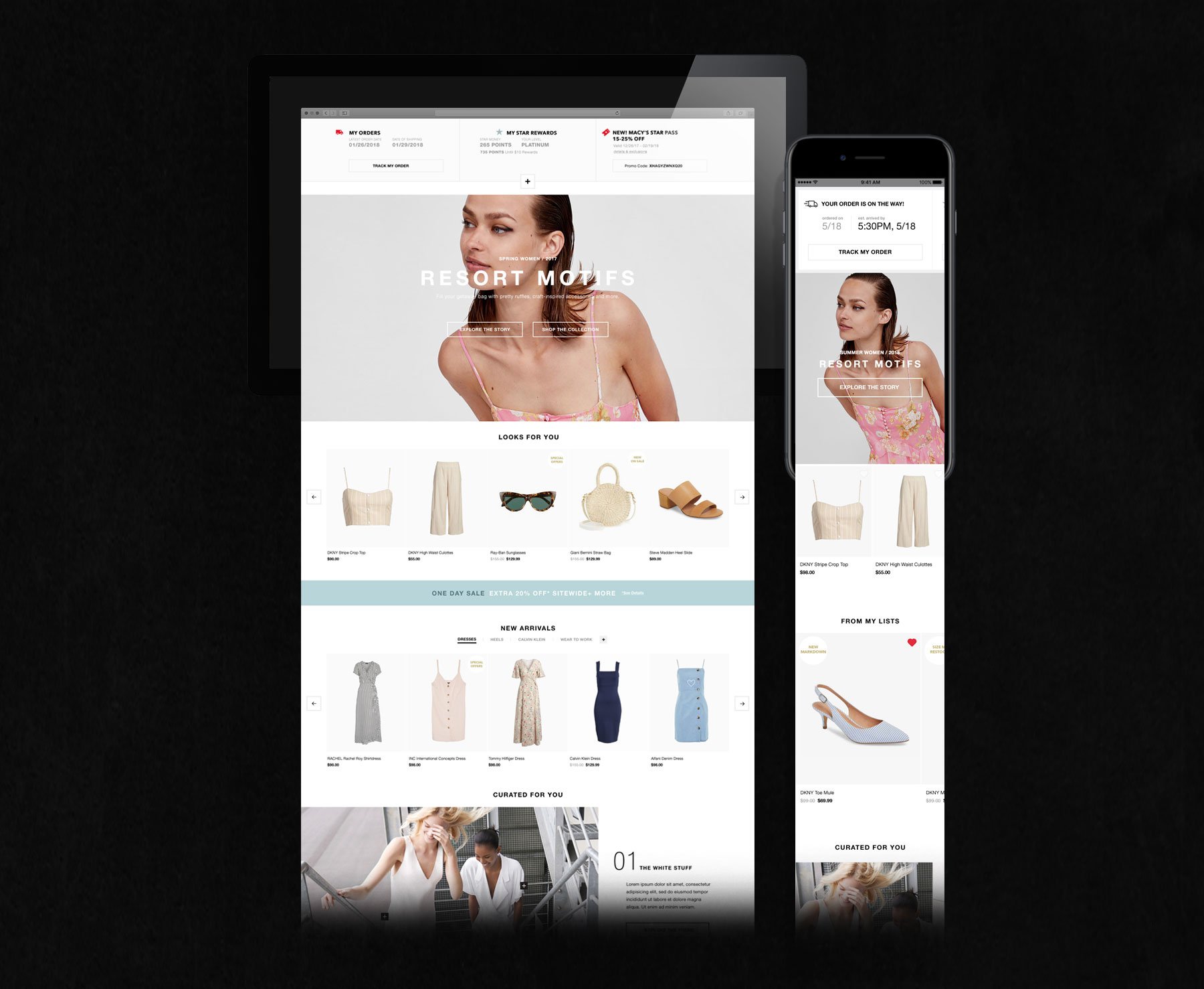
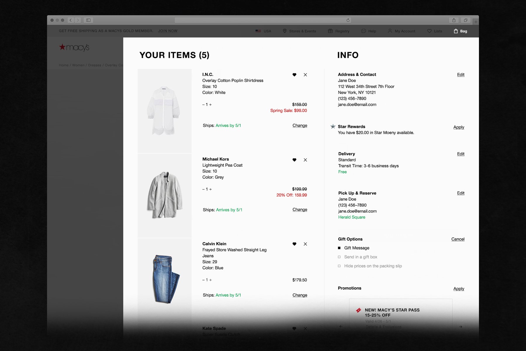
High Fidelity UI for User Testing


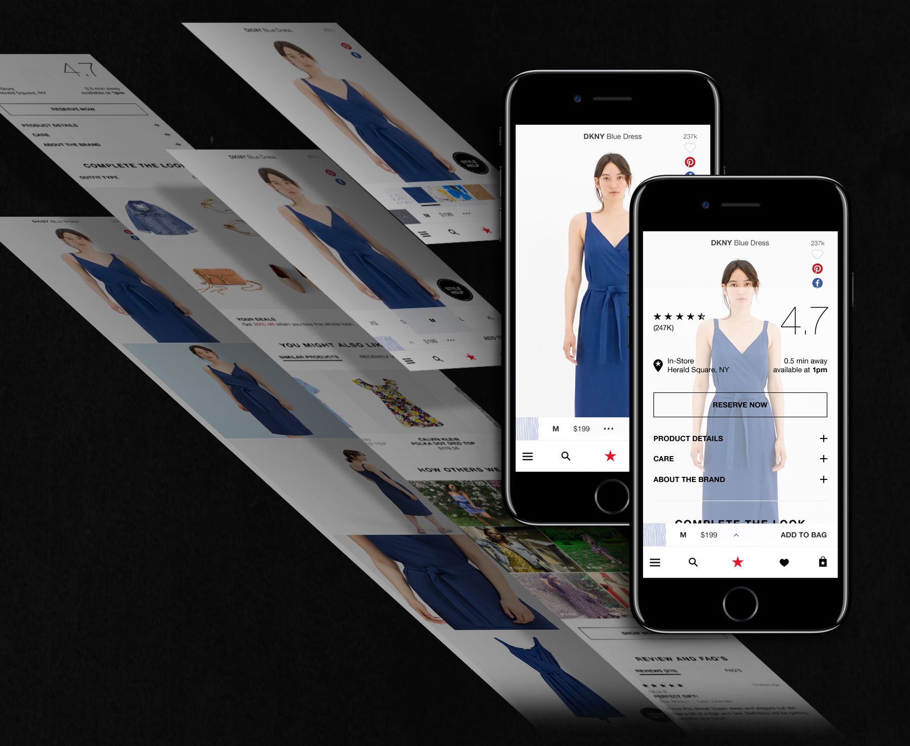
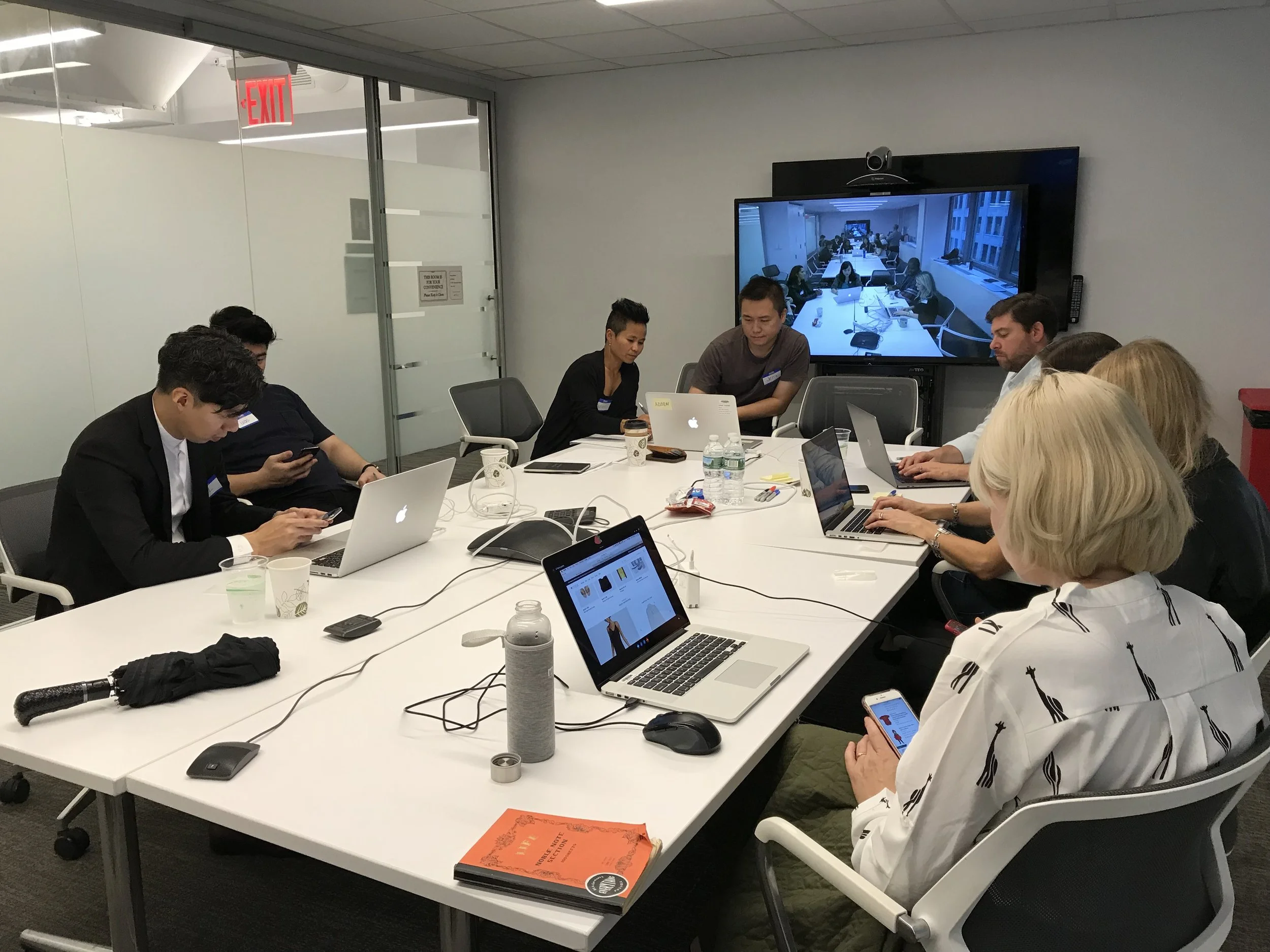
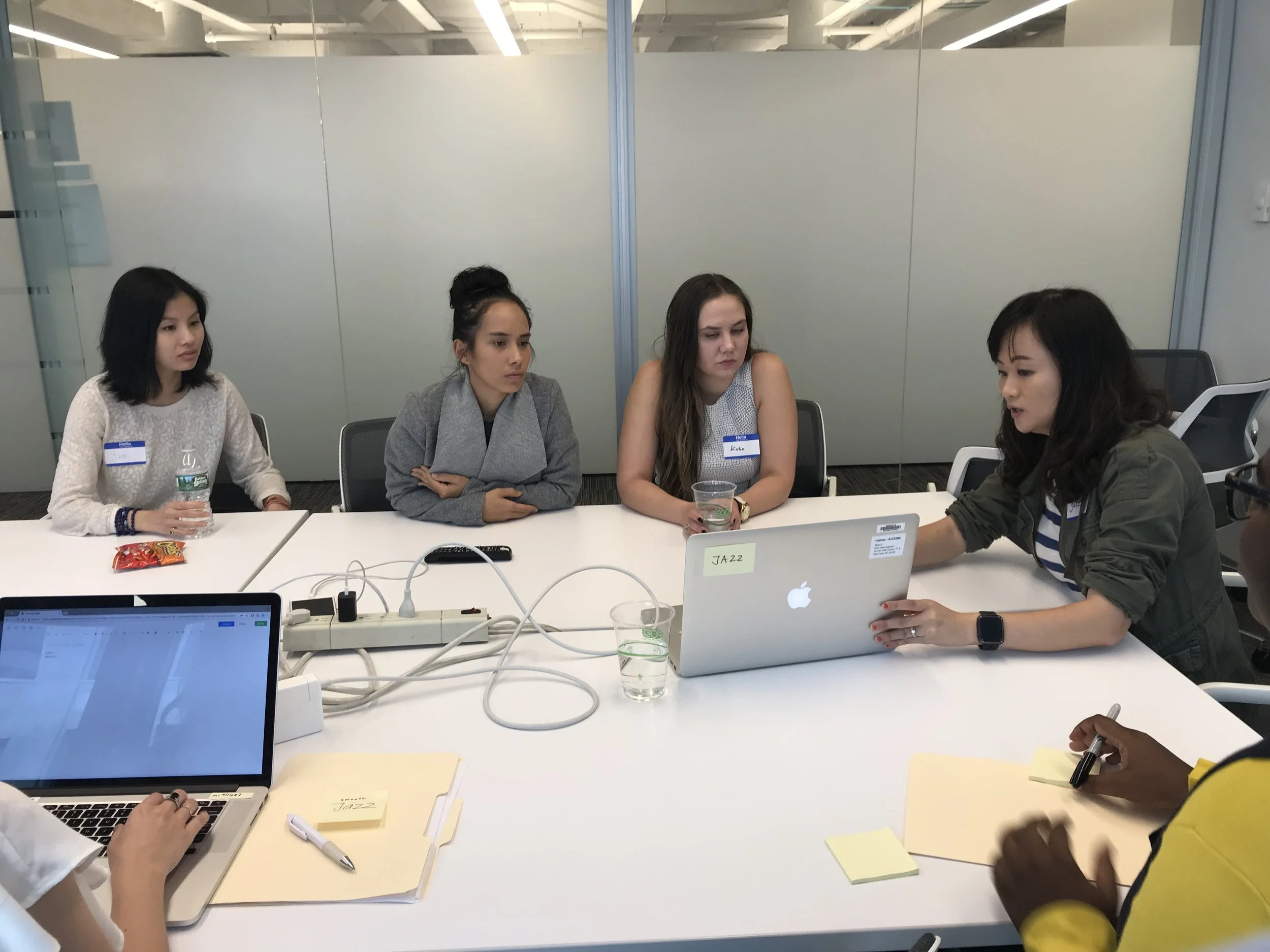
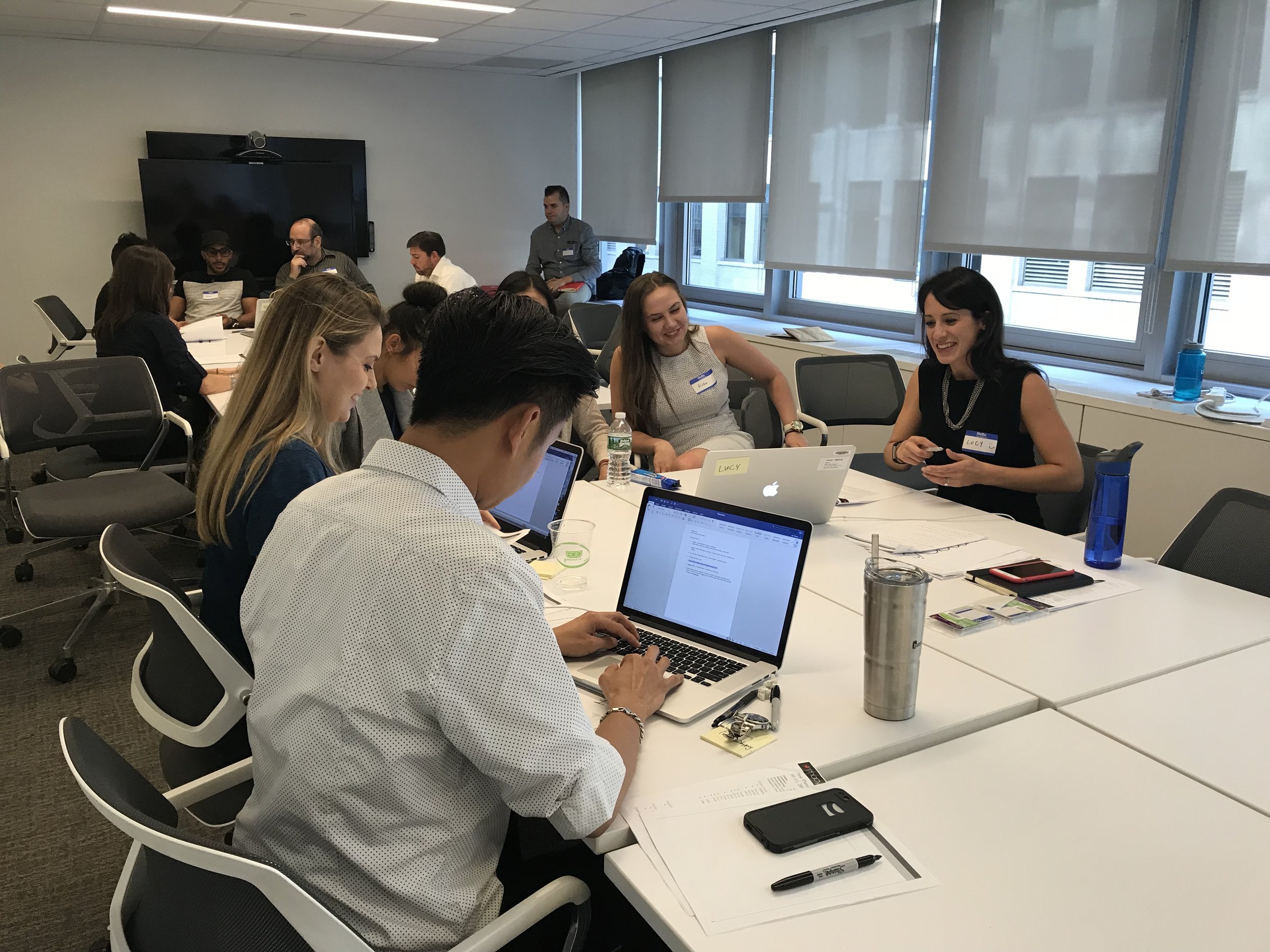
User Testing